

SCHOOL PROJECT - BERGHS
How can we facilitate saving and provide a better overview of finances for a passive target audience? Is it possible to address this through Open Banking?
What is this: School project from Berghs
Client: SEB Headquarters, Solna
Timeframe: 7 days, followed by a presentation to the client
Participants: Myself and classmate (Nathalie)
My role: Research, Concept development, Wireframes, and prototype.
BRIEF
Do banks need to be rigid, bureaucratic, and cumbersome? What if it wasn't so, what if it was enjoyable to interact with your bank? How can we, as a bank, become a relevant partner in the customer's everyday life? Identify a common problem where we, as a bank, can facilitate. Highlight a "pain point" and address this situation - through Open Banking. Suddenly, we have access to information from all other banks. What do customers want to see? What do they not want to see, and what feeling do we want to evoke?
Brief from Customer


RESEARCH/INTERVIEWS
After receiving the brief from SEB, I wanted to verify if their hypothesis and perception were accurate. I chose to conduct interviews with people around Kungsgatan/Sveavägen in the city center and asked them about their saving habits. We also sent out a survey to friends and classmates via Google Docs.
Our interviews yielded the following responses:
- Many found it difficult to know how much money they had to spend per month after all expenses.
- The most common method of saving for individuals was through a simple savings account.
- Many expressed interest in investing their money but lacked the necessary knowledge and time.
- Those who do save set aside varying amounts each month depending on their financial situation.
- Many give up on their saving goals when they fail to meet their milestones.
- The thought of saving/money management creates anxiety and stress for many.
- Many find stocks to be complex and have little interest in becoming informed about them.
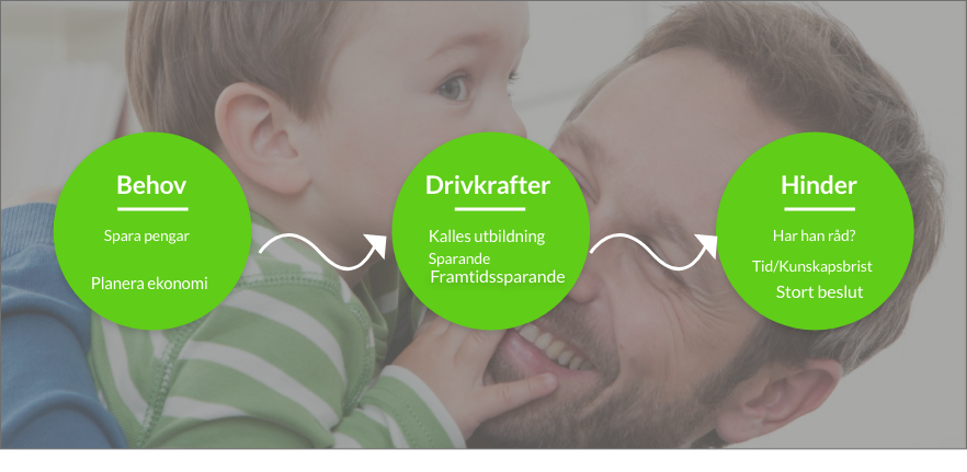
Our Persona based on Research
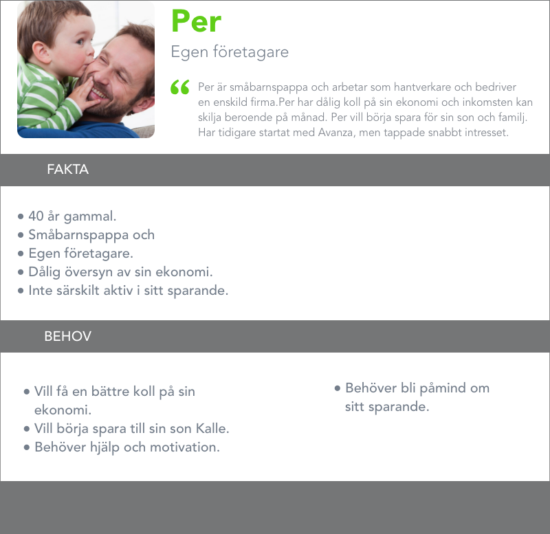
Challenges and Goals
- Provide users with a clearer overview of their personal finances.
- Make it easier to save and set achievable savings goals.
- Get people more engaged in their saving habits.
- Offer a tool that provides users with tips and assistance.
- Remind users about their savings in an encouraging manner.
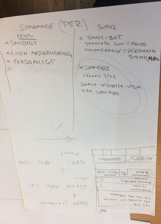
FIRST DRAFT
We began sketching our initial wireframes with features requested or that could solve our target audience's problems. We aimed to create a clear overview of the user's discretionary income, i.e., money left over after expenses. We started drawing on paper and tested the user flow at this stage by having students and classmates at Berghs try the app via Marvel Pop.
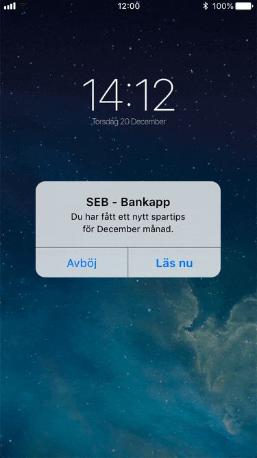
Do you understand what the homepage shows you? Start a savings goal Does the next step for the user appear clear? Follow the steps to set up a savings goal. Does it show what the bot does and says?
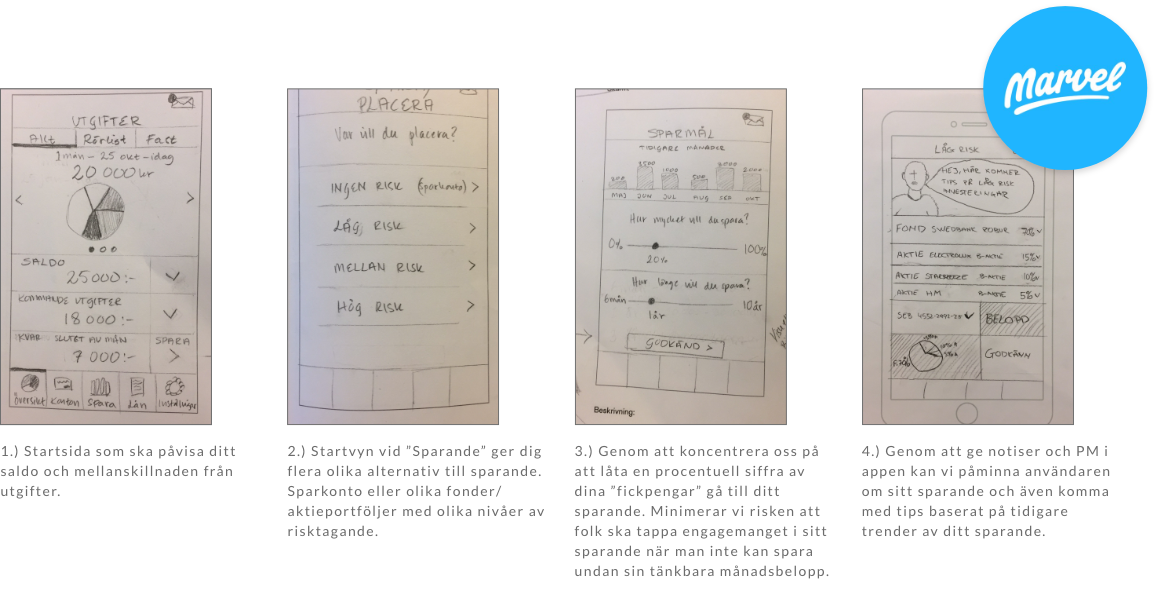

LOW-FIDELITY WIREFRAMES
After numerous workshops and idea generation sessions, we concluded that we wanted to create an overview of the customer's "money to spend".
That is, what the person had left to spend after all monthly expenses had been paid. To make it even smarter, we let the application recognize purchasing patterns from previous data. By implementing Open Banking, we can connect multiple payment cards and platforms, allowing the app to easily identify the user's purchasing patterns.


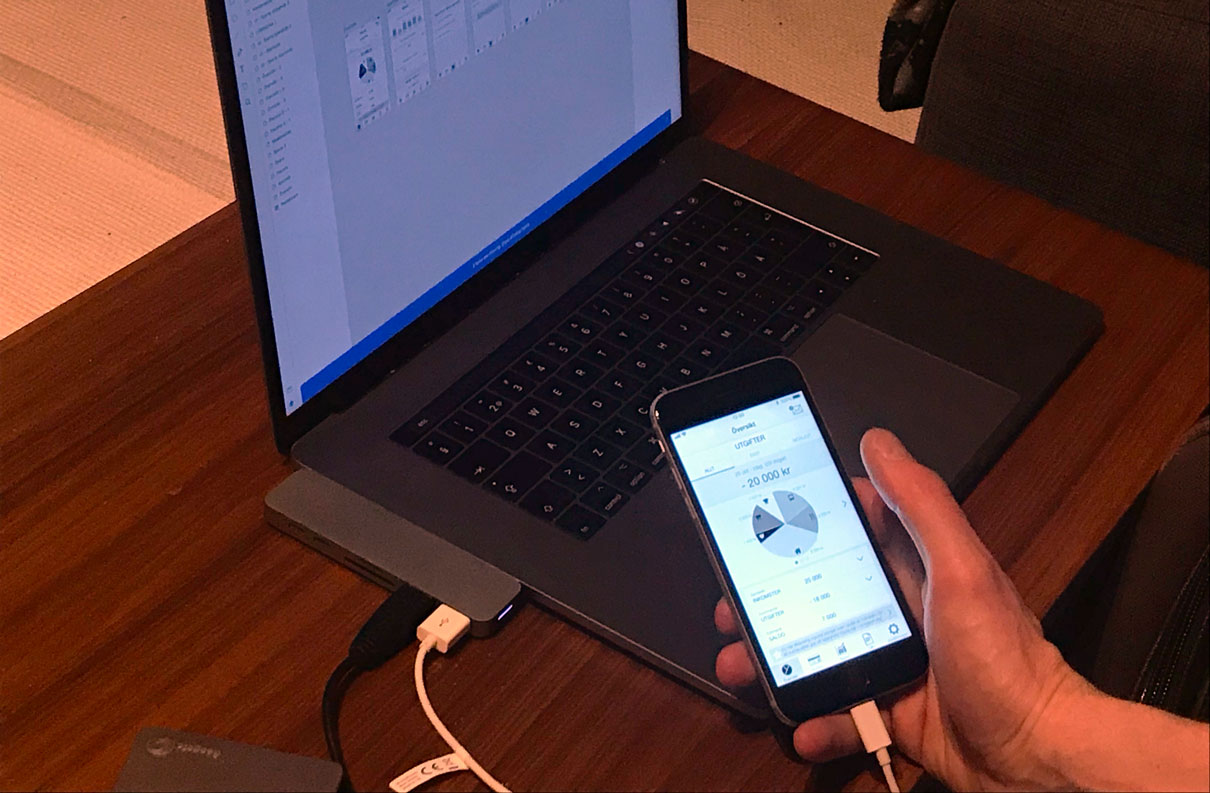
USER TESTING
HIGH FIDELITY WIREFRAMES
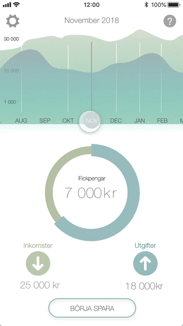
Our tests provided us with many insights into how we could make the application even simpler and more engaging. By creating a more minimalist starting view, we gave the user a clearer overview of their finances.
By changing the graph, users can see both backward and forward in time if the app has been used over the calendar year. The longer you use it, the smarter the application becomes, able to anticipate variable expenses and purchasing patterns.
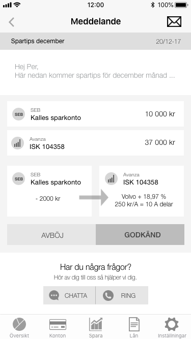
The focus on savings is to set aside a percentage of your "discretionary income" for the month. We do this to reduce anxiety or worry about not achieving classic savings goals. You set it, and the app spreads the transfer over the remaining days.
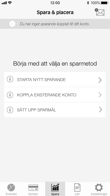
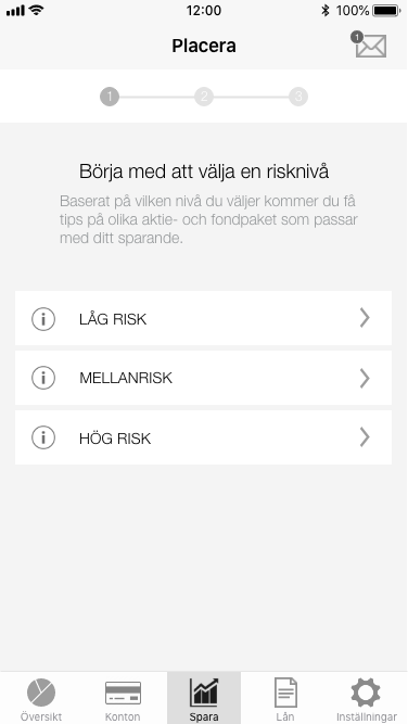
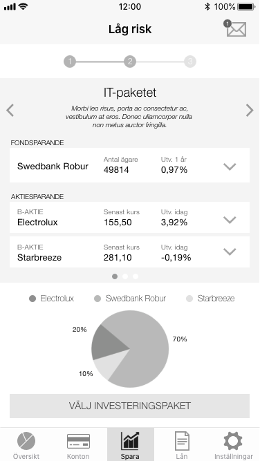
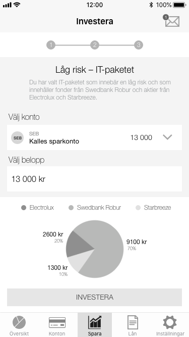
Users themselves decide whether to save the money in a simple savings account, stocks, or funds. Thanks to Open Banking, we can connect platforms like Avanza and other bank accounts and payment cards. If there are already existing accounts that are suitable, the app will suggest these.


Summary
This was one of the most rewarding projects we undertook during my education in UX design. We received a clear assignment from SEB, where we were provided with a brief and their research, and tasked with presenting a solution within a week. Exploring open banking made the work more exciting and interesting for me.
The presentation took place at SEB's headquarters in Solna, in front of their design and development team of 30 people.
We had time to answer their questions and hear their thoughts on similar solutions. It was also enlightening to conduct our own research, where we discovered several challenges beyond what SEB had provided us with.
Our concept simply builds on the data collected from all your purchases. The longer you use this application, the more it could calculate your expenses and purchasing patterns over the entire calendar year. By incorporating Avanza, we introduced open banking and an easy way for the application to provide tips and assistance for investments.
If we had more time for this project, I would have wanted to conduct more user testing on the final design, as well as perform a split test with variations on icons and CTA buttons. Our instructions were not to spend too much time on UI design and preferably only present grayscale wireframes. However, we found it difficult to resist adding some color, as we felt it made our graphs clearer.
alexander.parling@gmail.com | + 46761712672